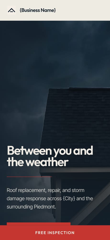
Contractor
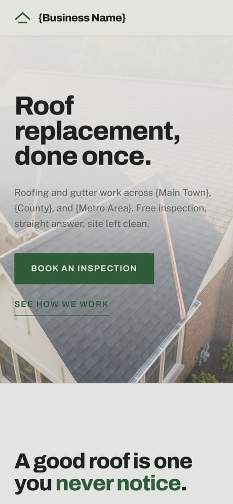
Work photography, phone number front and centre
For trades where people call rather than fill in a form. The number stays the biggest thing on every screen, and enquiries are stored rather than emailed into a void.
01 page
Kinds of website
One page, one thing to do at the end of it
A landing page is the right answer more often than people expect. If a business does one thing, splitting that thing across five pages makes it harder to find rather than easier, and every extra page is another one to keep current. One page also has a practical advantage on a phone: there is no navigation to open, no menu to mis tap, and the thing a visitor came to do is always the next thing down the screen.
The whole page is written toward one action: call, book, order, or send a form. Everything that does not serve that action is a candidate for deletion, which is a harder edit than adding a page and the reason one page sites often read better. It is also the fastest thing to build, so it is usually where a business with nothing online should start.
A page earns its keep by suiting the person who lands on it. These are not the same person from one trade to the next.
These are demonstrations rather than customers. Each one is a real deployed site you can open and use, built to show what this kind of business gets, with the business details taken out or never put in. Yours is built around your own.
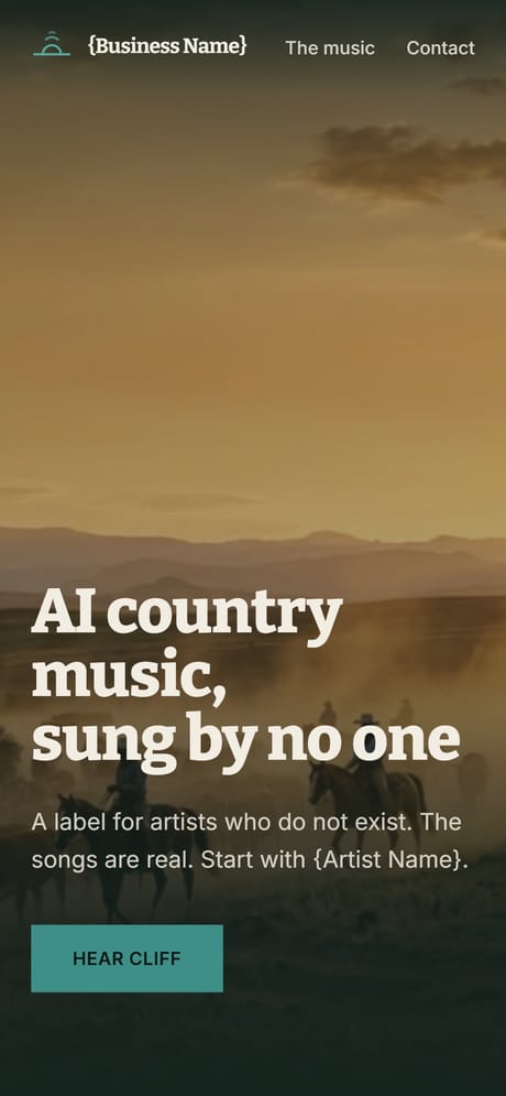
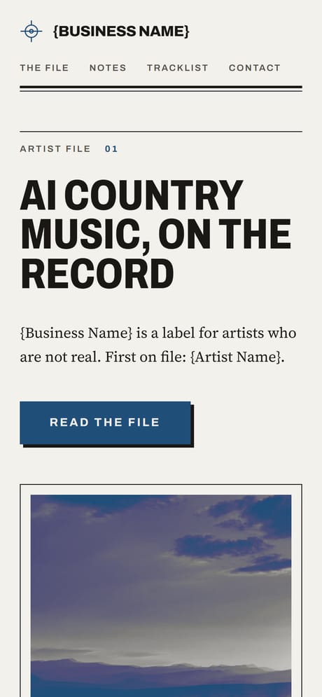
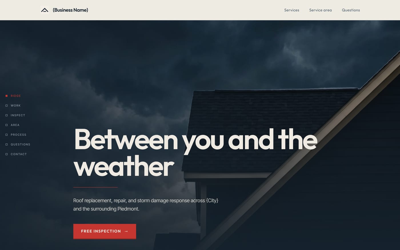
These four are single page builds, made for a roofing company and a record label. They are here for the shape rather than the trade.
Work photography, phone number front and centre
For trades where people call rather than fill in a form. The number stays the biggest thing on every screen, and enquiries are stored rather than emailed into a void.
01 page
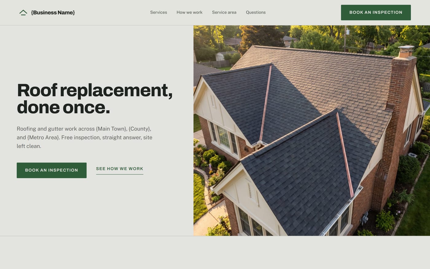
A quieter, more established look
The same information in a calmer treatment. Suits a business that wants to read as established rather than urgent.
01 page
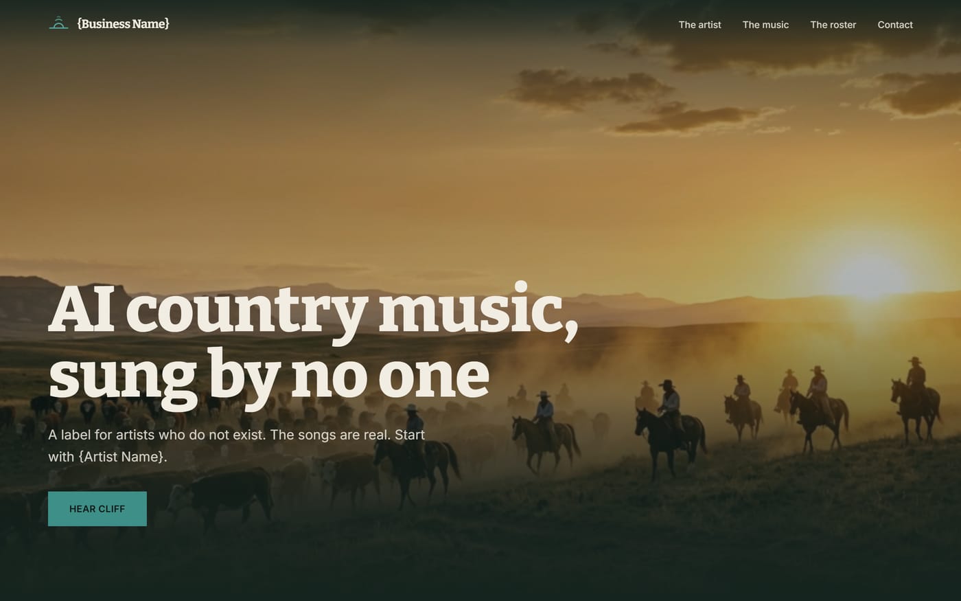
Full bleed photography, dark and atmospheric
For a business sold on mood. Large images, very little text, built to be looked at rather than read.
01 page
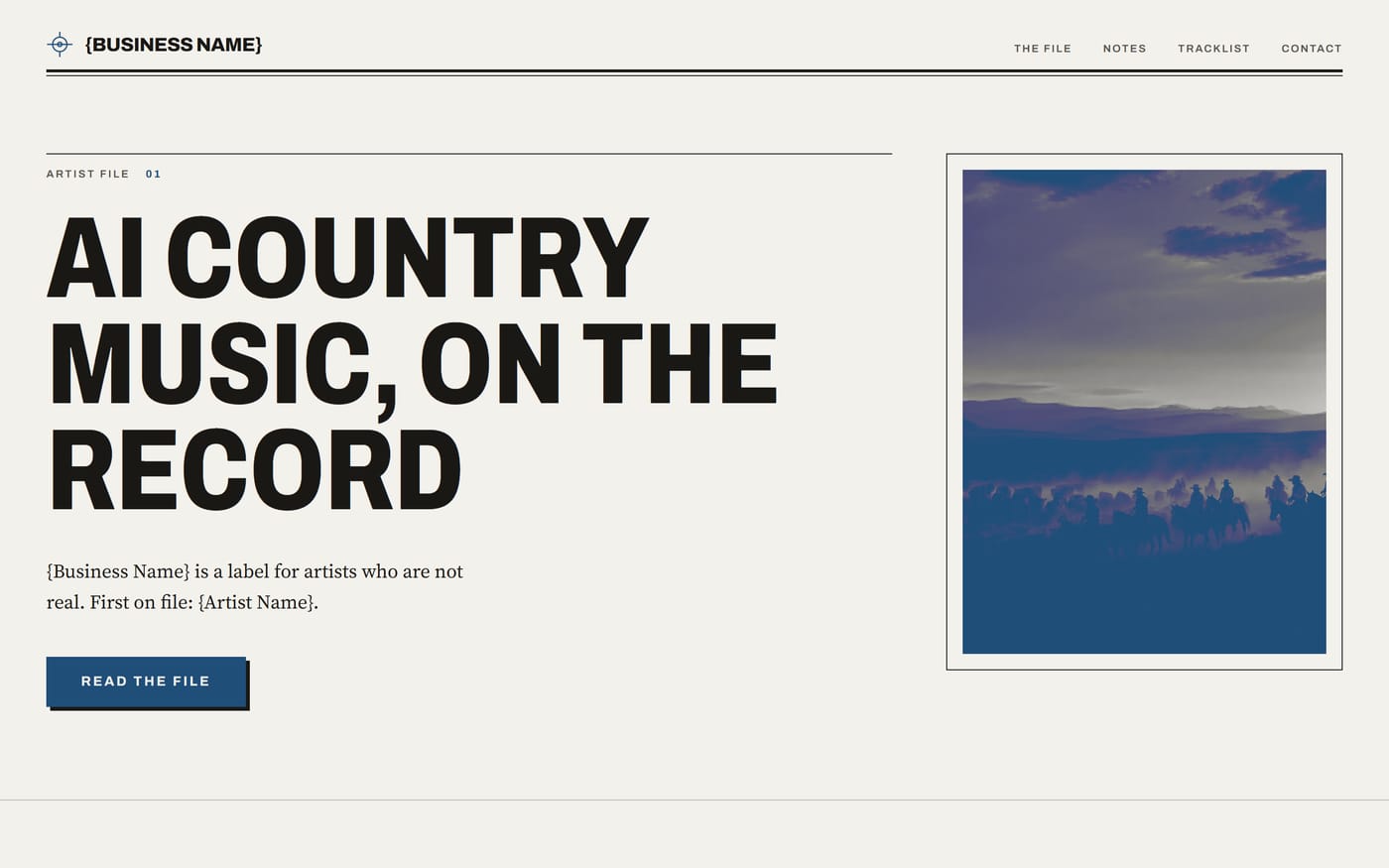
Editorial, set like a printed page
The same kind of content set like a magazine spread. Suits anything with more to say than a headline.
01 page
If none of them describes your business, say so in the form. The audit is free either way.